Q&A
Fashion
February 15, 2023
How Pantone’s Lee Eiseman Sees Color
Words by Polly Adams
Photos courtesy Pantone & Getty
The results are in. The Pantone Color Institute, the trend forecaster and color consultancy, has released a new edition of the Pantone Fashion Color Trend Report, just in time for New York Fashion Week (NYFW).
The report’s carefully curated palette of 15 colors reflects “a new reality,” one shaped by the omnipresence of digital technology and a human need to unleash pent-up, post-Covid energy. Defining this moment is the Institute’s Color of the Year, Viva Magenta, alongside others in the red family, like Red Dahlia and Rose Violet, as seen on the runway this week.
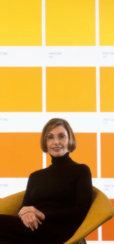
Can one color really influence the entire fashion industry? Huge Moves asks renowned color guru Leatrice “Lee” Eiseman, executive director of the Pantone Color Institute. Here, she explains how color, technology and our collective consciousness drive fashion culture forward.

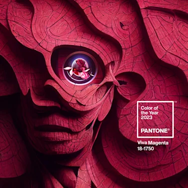
Pantone’s Color of the Year 2023 is Viva Magenta
The Institute’s color choice each year is said to reflect the latest trends across fashion, beauty and technology. What brought you to Viva Magenta?
We always arrive at a decision based mainly on the zeitgeist. How are people feeling? How are they reacting to color? We are very mindful of the psychology.
When we choose a color, it’s not just because it’s pretty or we’ve never used it before. It’s impossible to ignore what we’ve just come out of, what we’re still coming out of, with the pandemic. We’ve all been sequestered and anxious over the past several years, but we’ve also been encountering the larger message that life must go on, and we need to muster the energy for it.
A lot of the trends we picked up across industries like entertainment, fashion, cosmetics, automotive and technology evoked a sense of new energy — or the seeking of it. And so our thoughts turned to what helps energize people, what helps them feel more empowered.

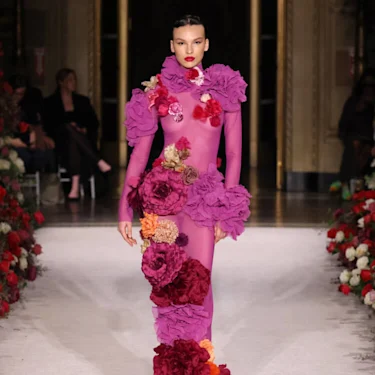
Christian Siriano’s Fall/Winter collection features Viva Magenta, Red Dahlia and Rose Violet. Credit: Getty Images
Viva Magenta has been described as “brave and fearless, a pulsating color whose exuberance promotes optimism and joy.” Are you seeing that on the runway?
Designers are giving themselves permission to be more experimental, particularly with color combinations that we’ve never seen before. There’s a lot of play going on right now in the red family, from the bright Viva Magenta to Red Dahlia, which is very deep, right alongside the lightest shade, Tender Peach. When used in contrast, it shows you how vibrant the colors are, all while working within the same family.
There is a lot of warmth in the Fall/Winter collections, but a lot of unignorable brightness, too. There’s clearly a need to come out of the doldrums and have fun with color without playing by ‘the rules.’
This year’s color inspired the Magentaverse, an experiential exhibit at Art Basel exploring the “dynamic between artificial intelligence and human creativity.” What role do you see AI playing at Pantone?
I have to say first that the human mind and the eye of the designer are not going to be replaced. Designers can use AI as assistance, but to say that the digital world is going to overtake the human world of creativity? I don’t see that happening. We believe at the Institute that human creativity and artificial intelligence will continue to co-create — that one will aid the other.
On the consumer level, there’s a growing appreciation for AI, but there’s skepticism as well. The point of this is that we can’t be so single-minded. It’s a complex duality between people and technology. Inevitably, both will work together to make the whole area of color grow and prosper.

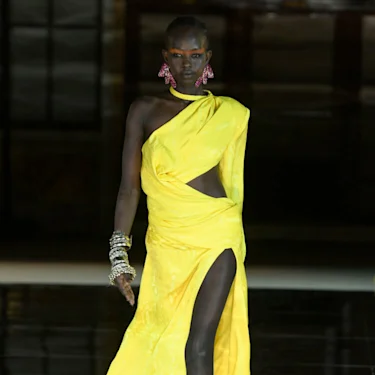
A model walks the runway in High Visibility yellow at the Prabal Gurung show during New York Fashion Week. Credit: Getty Images
You've been quoted saying that Viva Magenta is "rooted in the primordial." What’s the connection there?
When coming to our decision, we thought about the fact that there are all these new technologies, but also a lot of pushback against them. Within the world of fashion, we’ve seen a slow and steady climb going back to using natural dyestuffs in place of the more technologically advanced or artificial options.
We also felt that we needed a symbol for Viva Magenta, so we landed on the cochineal insect that carmine dye comes from. It’s a gorgeous, vibrant shade that’s been used by humans for centuries. Even still, the bug replicates itself again and again, and we see no signs of it disappearing off the face of the earth. And that is where empowerment comes in. Think of how that tiny creature has managed to exist through the ages. It is empowerment, embodied.
Retail fashion is seeing increased consumer demand for natural, biodegradable apparel. Can this trend reconcile with technology’s march into artificial, virtual worlds? Must we choose sides?
It seems contradictory, doesn’t it? However, I think both can coexist. Technology can help us arrive at a better usage of what exists in the natural world. More knowledge always leads us in that direction.
There’s definitely a movement to go back to more natural resources, and technology might help us become less destructive. I think there are enough people now on both sides of the fence who realize there has to be a happy marriage of new technology and the lessons we’ve learned from the natural world. The only way forward is to coexist.
How has technology changed the way we think about color?
Take the entertainment industry: It was such a big deal when TV went from black and white to color — it opened up a whole new avenue and respect for the usage of color that no one saw coming or understood how to talk about.
In terms of fashion and textiles, technology has had a big impact on what colors are even possible to achieve. With newer textiles on the market today, we’re starting to find fabrics that have more of a sheen, glow or color variance than we’ve seen before.
The technologies behind developing and manufacturing color involve not only the hue but also the texture. There’s a very important marriage between the two that, across industries, has unleashed a whole new way of thinking about colors and what they mean. Today, we see color in different ways across all our devices, and there’s this idea that we’ll even be able to make new colors. I believe that’s going to happen one day.
Does the Color of the Year have an impact on the industries it’s influenced by, too?
Absolutely. It’s not a one-way street. More than anything, I think the Pantone Color Institute’s success just tells us that people are forever fascinated by color. They are charmed by it. They have positive responses, they have negative responses. Either way, the emotional aspect of color is incredibly powerful.
When a color enters our collective consciousness, it’s easier to pick up on. When you go out or online to shop, something clicks in your mind. And that particular shade of red, which happens to be the Color of the Year, starts to make its way into your life. You start to think, ‘I'd like to have something in that color.’
Remember, that’s what trends are all about: the marketplace. Trends attract the consumer’s eye; they’re meant to get them excited. Trendsetters are just the first to hop on the wagon.
Polly Adams is a senior copywriter at Huge. Editorial disclosure: Pantone is a current client of Huge, the publisher of Huge Moves magazine.
